
Shaanxi Rongxin Credit Management Co., Ltd. was established in August 2012, it is a professional enterprise approved by the National Bureau of Statistics of the People's Republic of China and the Administration for Industry and Commerce of Shaanxi Province. It is a professional enterprise credit service organization with the main business of enterprise credit information collection, enterprise credit assessment, credit investigation, credit report, credit contract registration, asset management, commercial account management, social investigation and market investigation.

THE PROBLEM
Banks, small loan companies, guarantee companies and other financial institutions are having difficulties evaluating the applicants’ credit for loan approvals.
THE GOAL
Design an app to provide banks, small loan companies, guarantee companies and other financial institutions with credit reports and credit management services in order to prevent and resolve financial risks
Target audience
Project manager at banks, small loan companies, guarantee companies and other financial institutions who need to view the credit of small businesses for loan approvals.
MY ROLE
I worked on user interface design as well as part of the interaction design closely with the product manager and the development team.

At the year of 2022, Vered Bigtree Technology Co., Ltd start its official cooperation with Shaanxi Rongxin Credit Management Co., Ltd. in order to bring a more compatible and digital solution to the current credit management solution that Shaanxi Rongxin has offered.
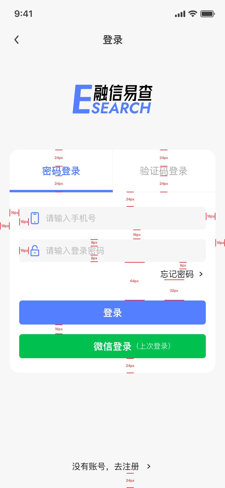
As a newly collaborated product by Bigtree and Shaanxi Rongxin, E-search app is designed to have a new visual appearance to introduce the new collaboration of the two companies. After closely discussed with the product manager, I have set a minimal set of tone for the app with grey and white in order to make the information stand out since the app features important and confidential information. It is essential to make sure the top priority for navigating through the app is the information being shown due to the characteristics of the credit management services.

I used #547FFF as the main action color for the app in order to inherit the Bigtree’s visual identity, and the contrast ratio for #547FFF and white 3.58:1, which pass the accessibility contrast for UI component. As most users for the app ranges from age 35-65, it is important to make sure that the target users are able to view and check all the detailed information clearly.

lo-fi prototype for viewing the credit report

user testing feedback
There are tweaks and changes along with the process of developing the lo-fi to hi-fi design prototype. Due to previous project experiences and user feedbacks from the lo-fi prototype, there are several points needed to be focused on when designing:
Feedback 1: Users want to have an easier navigation and step by step indication if there are dull and complicated forms to fill out.
Solution 1: I used a progress indicator on top instead of 4 steps being highlighted as each step comes along to showcase the current stage of the user.
Feedback 2: Users did not know what to do when it comes to the authorization page (where the big WeChat icon shows up on the page).
Solution 2: I removed the big icon and made two regular cards indicating whether the user should send a WeChat message or send a direct text message. The logic here is either one or the other, so that it complicates the users’ navigation to have two tabs on top for users to choose from. The use of regular click-through cards simplify the user flow as well as making the users more determined about what to do next.
Feedback 3: The credit analysis report was so tiny to look through. It’s impossible to see the details.
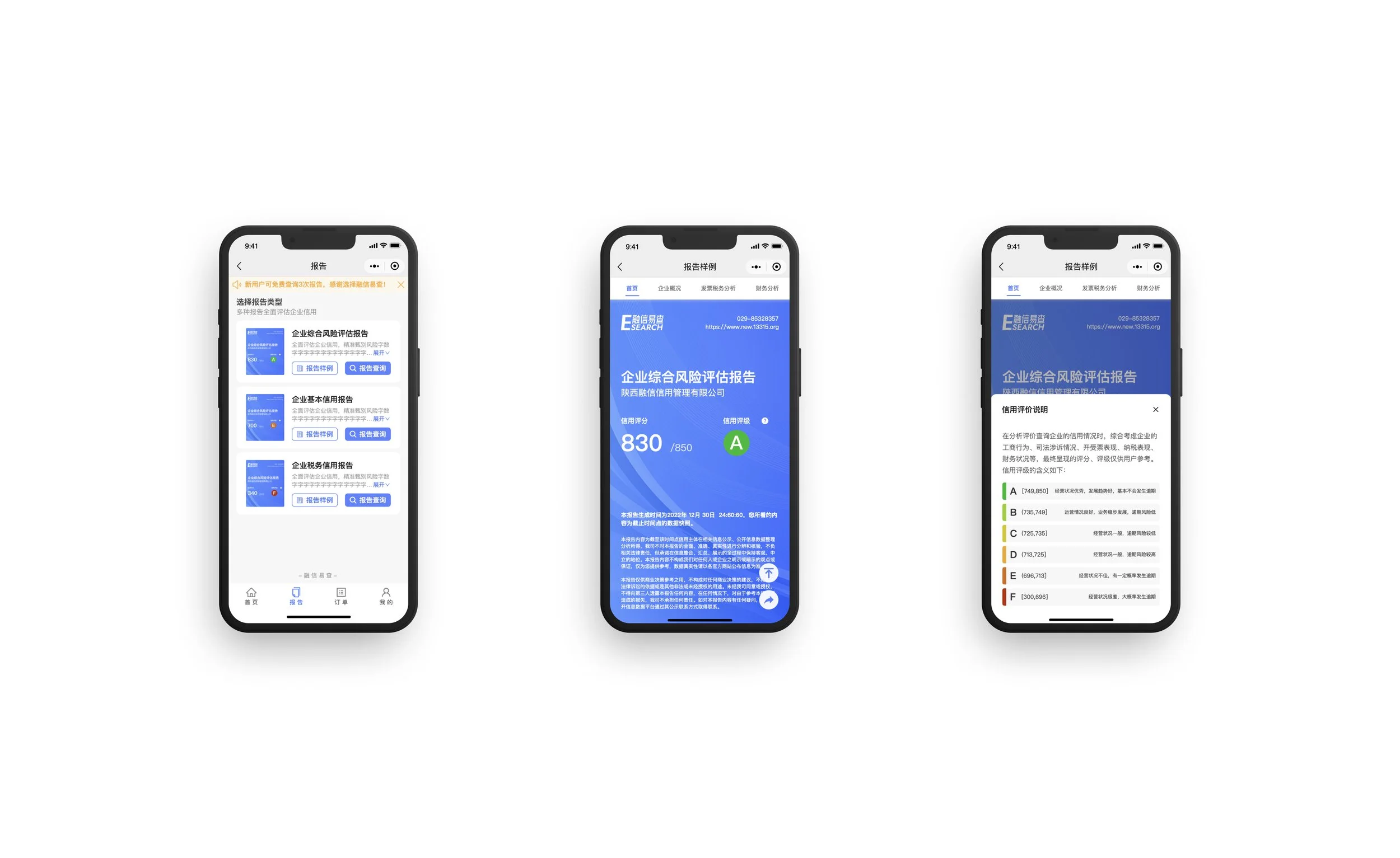
Solution 3: At first we formatted the report in its original printing format and users would need to zooming in to see all the details, but we realize that it’s not efficient for users to go through such a big amount of information. I customized the report into a mobile-friendly format for users to check all the details. I added 4 tabs on top for 4 sections of the report so that users can target onto the topic they want to check.

Key challenges or constraints
One of the biggest challenges was the timeline, I got a really tight schedule to make the design changes and I work closely with the project manager and the developer to see the fastest way of making the best of it. We tried to use the UI element sheet we defined as building up the app in order to be raise efficiency on both my side and the developing side.
Another challenge was that the client side, even though our team was trying to make the best of it at a very limited time schedule, the client always wants it to be perfect. We didn’t compromise on the interaction and the visual design of the user interface, and we came up with a plan b for simplify the interaction first, and then fulfill what we planned to do in the next iteration cycle.
Also it has a tough challenge that the report part, even though the content on the report is overwhelming, adding tabs on top helps users to find the info they want on a certain level, it is still hectic for users to look through. Plus, risks management department was informing us that certain data on the report does not have a high accuracy for the users to view, so that I had to come up with a plan to make some of the data secondary - at first it was the primary info standing out as one single bold card on top of the screen. Now it’s presented as a secondary info which shares the same hierarchy as other data being shown.


Iterations on the report

Final Delivery on the Report Page (at the current stage)
A few iterations were made to the report in order to give users a clear understanding of the information when they take only a glance at the screen. Based on the user feedbacks, we came up with the final design delivery shown on the left:
A specific color scheme was defined for the credit evaluation, and the report was designed with a colored dot with the credit levels representing the evaluation of the company reviewed. The use of color brings a direct link to the credit level, and as the overview page which gathers all the reports, the screenshot of the report cover brings a clear preview for the users to understand from the thumbnail directly.
possible next steps
Develop a better way of presenting the report for viewing the credit of the small businesses: Users still find it overwhelming at the moment, and it might be useful to look through some data visualization project in order to make the rigid report more playful/easy to understand.
Conducting more user research to understand user needs at certain time basis.
Considering bringing accessibility into the scope
Providing a printable version of the report for the users so that they can print the report directly off their phone.