
[aeris app] is an app designed to bring a smart solution to the traditional way of controlling an aeris air purifier, making it easier for the user to control their device wherever and whenever they want.
Aeris Cleantec AG is a Swiss startup founded in 2015, focusing on making products to protect people from pollutions and promoting a healthy lifestyle.

Conceptual model/ Objective
Providing the easiest and the most intuitive way for customers to control their air purifier while offering customers valuable options to improve their living quality and health standards.
My Role
I was in charge of the UI and part of the UX for this project. I worked closely with Kevin Steiner, the project lead for aeris app, and software team to make this app come true. Tools being used are: pen & paper, adobe photoshop, adobe illustrator, and sketch.
FROM 0.1 TO 1.0, THEN TO 2.0
Background
aair is an innovative air purifier that delivers unparalleled performance in an elegant and stunningly quiet package. Combining cutting-edge air purification technology with proprietary intelligent software, aair sets an unprecedented benchmark for the highest air cleaning rate amongst same-size competing products. This app we are making is the smartness of the device, aeris app offers customers an opportunity to control their device and check the air quality whenever they want, and wherever they want.
Primarily this app is designed for using aeris aura, the first generation air purifier. I closely worked with my co-workers to start designing this app from scratch (from pencil sketches, to paper prototypes, to final UI decisions, to programmers really making this thing happen) we got lots of feedbacks from colleagues, friends and customers. There have been lots of failures, and lots of learnings through the entire process.
Challenges and constraints
Time constraints: The launching date for the product was set, so that became a deadline for developing the software app in order to chase up the grand opening for the product. We got less than 3 months to develop the app from scratch, so that left us with no time for too much details of the animation/ interaction design, more time was consumed to make the user flow accurate and efficient for users.
I’ve never worked with hardware/ product designer before for industrial design project, so that dealing with CAD files and 3D renders in order to get a simplified version of the outlined graphic was a challenge, and I had to do a lot of cleaning of the illustrator file, which was worth the time when everything in the end turned out tidy and presentable.
At the same time I did the troubleshooting animation with AE and work together with our hardware developer in order to make the screen showing the right animation for the actual device, we tweaked that for a long time. It was an exciting experience.
Back then I was making everything on my own without the help of any design UI system element sheets so that the process of making the big aeris app design system is slow and a huge amount of work.

UX flow of the signing in process for v1.0:
1. phone number and password as the entry page of the sign in process, with sign in button at the bottom, and create account option for users who are new to aeris. Forget password option is available for users to retrieve their password.
2. new customers use phone number to get an account, which is easier for us
V1.0 is trying to create a tidy and clean visual direction for the app, whereas 2.0 goes to a updated version of the brand image overall - switching to dark mode to introduce a more dynamic aeris image to the users - to deliver that our brand is more than what we had as a basic air purifier controller. And we bring in ‘signing in with WeChat/Facebook’ so that it eliminate the process of signing up, which can be time-consuming and obnoxious for some of the users.


Setting Up flow for v1.0
When users first log in to aeris app, they need to set up their device, either aura or aair (aura is the first generation aeris air purifier), and after the setting up process, they will be able to get access to all the functions that I'll introduce later in this post.
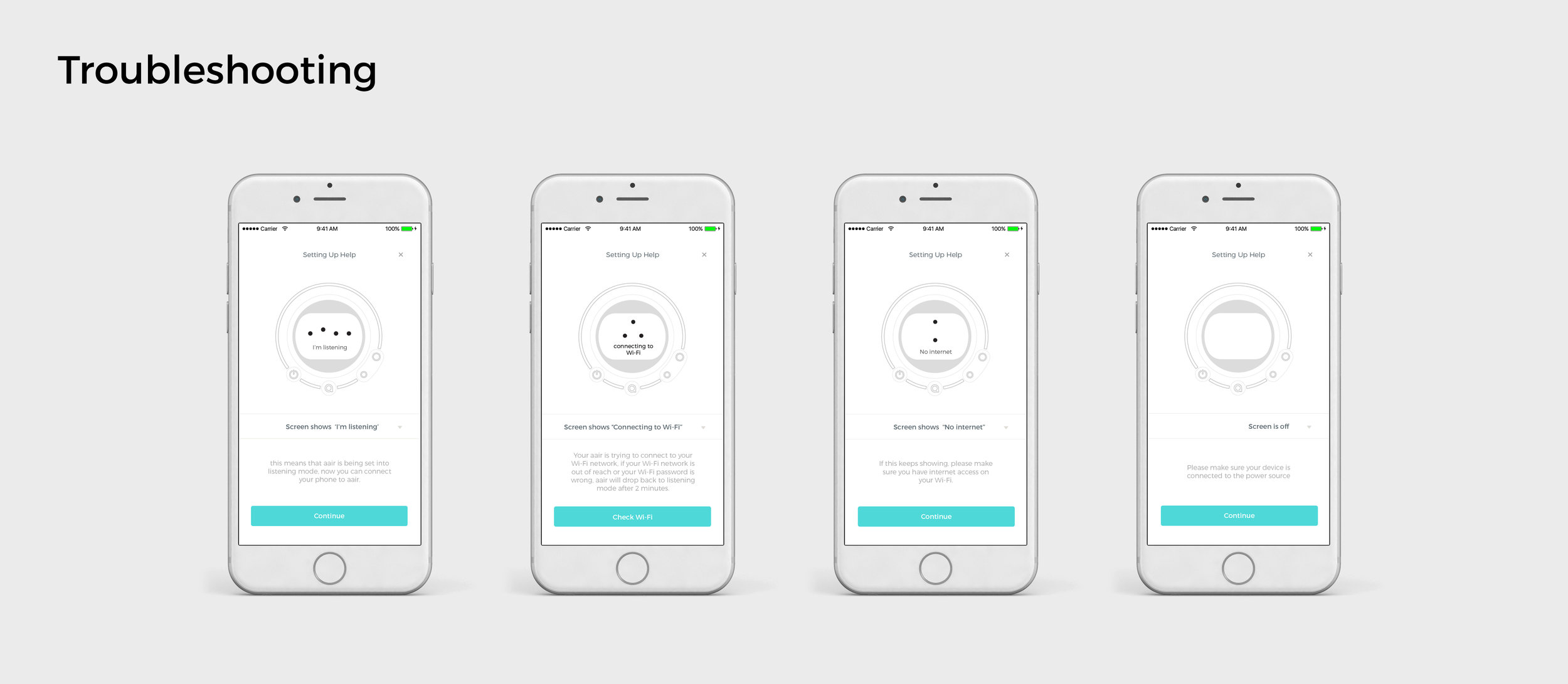
Troubleshooting UI shares the same look as the device UI, users can get a direct link to the device and they know where the issues are:

v1.0 Summary page is a in-general gathering page for the entire app, the purpose of this page is to give the user a overall overview of the entire app, from device control, to air quality check, to insight of the status, to some health tips.

v2.0 of the summary page
Based on the feedback from v1.0, whereas the summary page contains lots of information that is not essentially crucial for the users, we ended up making the page cleaner in terms of the content. Having a swiping cards on top gives users enough information, and the first one is always showing the AQI of the location of the user. Adding devices now is added to the summary page for users to easily connect their device and check the status. Insights of the status seemed secondary based on user feedback, so that it’s now showing after users click each device to get to know more info.
Control function is a direct and intuitive way for the user to interact with the physical device of aair. There are 3 modes included in aair:
Sleep Mode: This is a low fan speed mode in which enables a low noise level of aair, customers are encouraged to set the device into sleep mode at night time or when they are sleeping, aair is still able to ensure the air quality in the room.
Smart Mode: Smart mode offers a smart solution for customers according to the air quality, there's no need for customers to manually control the device, it will automatically switch through different fan speed levels to clean the air and to ensure the best performance.
Manual Mode: There are 6 levels of manual modes involved, manual modes simply means that users can control the fan speed of aair, from the lowest, in which equals to Sleep Mode, to the highest fan speed, which can cleans 70sq meters area in 12 minutes.
Many iterations have been tested for the control page:

some of the iteration examples that we didn’t use
To simplify users’ learning process as well as making the interaction easier, we tried to get rid of many excessive/ over complicated design ideas even though some of them might be visually interesting and much more engaging the user in a way; however, the goal of the control page is to make sure that users can control the air purifier when they first open this page.

Final Control Page for App v.1.0
Users can choose different mode shown on the ring, and single tap would trigger the ring to rotate into different mode.

Final Delivery on the v.2.0 of the control page
For the final iteration on v2.0, I tried to keep the fun aspect of the interaction whereas users can be able to ‘play’ with the ellipse (representing the ring on the physical device UI), but to make it easier and simpler for users. From v1.0 I learnt from user feedback that users have had a hard time recognizing different mode on the ring, so that for v2.0 I divided the ring into 3 parts, and each one representing a mode. I kept the tap gesture as it’s simple enough for users to control, and it triggers a simple expanding animation which highlights the current mode chosen. Users found it easier to understand the mode they are using comparing to v1.0, and we got less comments from customers having difficulties on controlling the purifer.
We have had positive feedbacks on the control page that users find it easy to navigate through and control the air purifier.
The UI of the control page is pretty straight forward, we don't want to create extra thinking process for the users when they are coming to this page, the ring design is to match the device UI on aair (please see pic on the right). We designed it in a way that reminds people about the device, so users would directly know how they are controlling the device right away. Inside the ring, we discussed to show the indoor and outdoor comparison of the air quality data, so that users would know directly whether or not their air quality is good, and they can control the device the way they want. For manual mode, we show 6 levels on the ring, again, straight forward to the users. All we want is simplicity, we don't want to bring confusions for the users.
Analytics Data
Options of PM2.5 and AQI are being offered since they are the most important ones that people actually care about in China, for Mexican market, we offer O3 as well because O3 pollution is more severe in Mexico. Users can easily scroll through the timeline in order to view the history or to check the current status.
Analytics shows a history curve of the air quality, with comparison between outdoor and indoor data, giving users a straightforward and visual response toward the air quality.
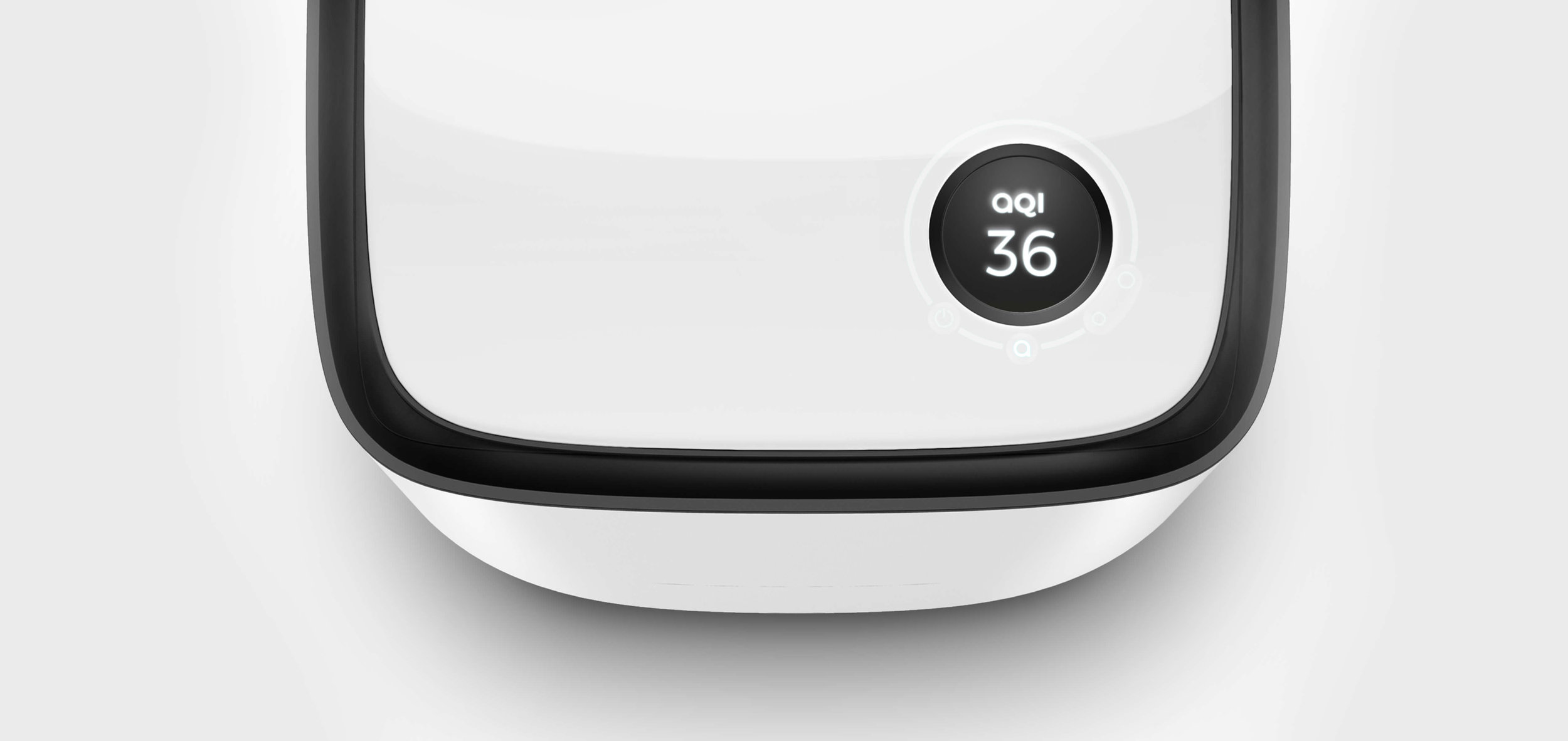
device UI of aair

v1.0 of the analytics page:
real-time analytics of the outdoor and indoor air quality, users can choose between AQI and PM2.5 values as well as displaying scale of hourly, daily, and monthly.
Color choice
Color choice for the air quality index draws studies from the official air quality index, but we found it too bright for aeris branding, and we make the entire color set for air quality more subtle and more close to aeris app UI color set.
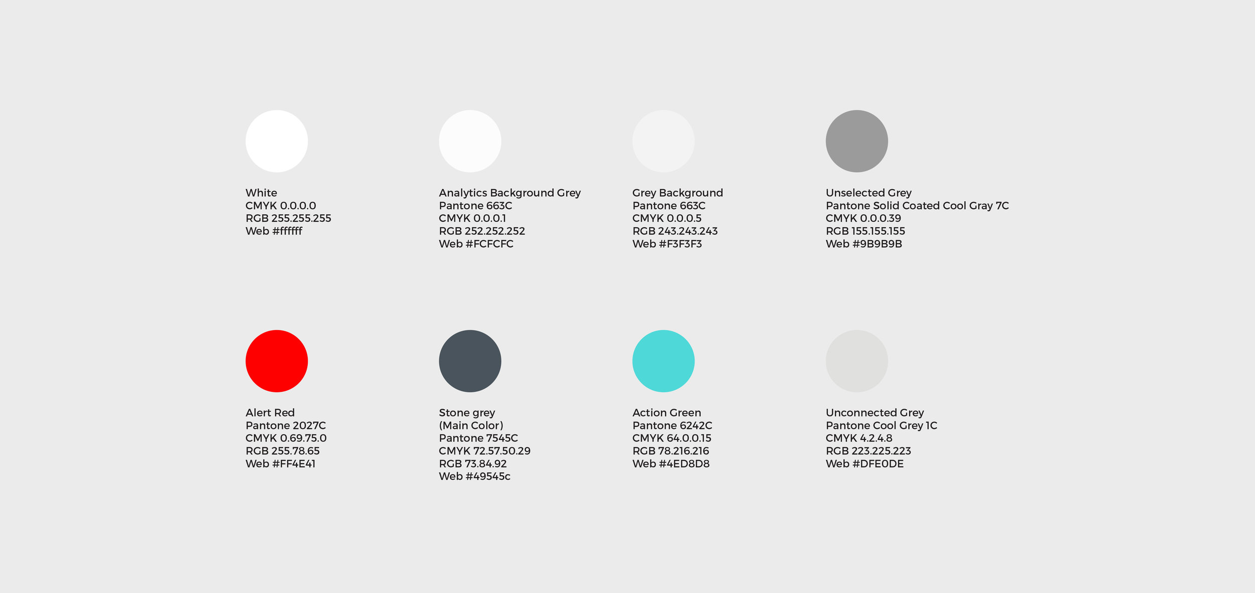
app UI color set

air quality index color of aeris app
User can see a device list which includes the devices they are controlling, the status of each device, and the remaining filter life. Filter life estimation gives users alerts and let them know when it's about time for them to change the filter. Original icons are created specifically for this app (please keep reading). Main page of device management is using the principles of card design as a basic, and users get to edit device name and device icon, to view device status and filter life estimation, and to order filters when the filter life is about to end.

Smart program feature
Users can use program function to let aair know their daily schedule and living routine, so that aair can perform in the way that provides the best service to users. For example, users can set a program saying that they normally would be sleeping from 23:00 - 7:00 from Monday to Friday, and aair will automatically turn itself to sleep mode at the specified time range.

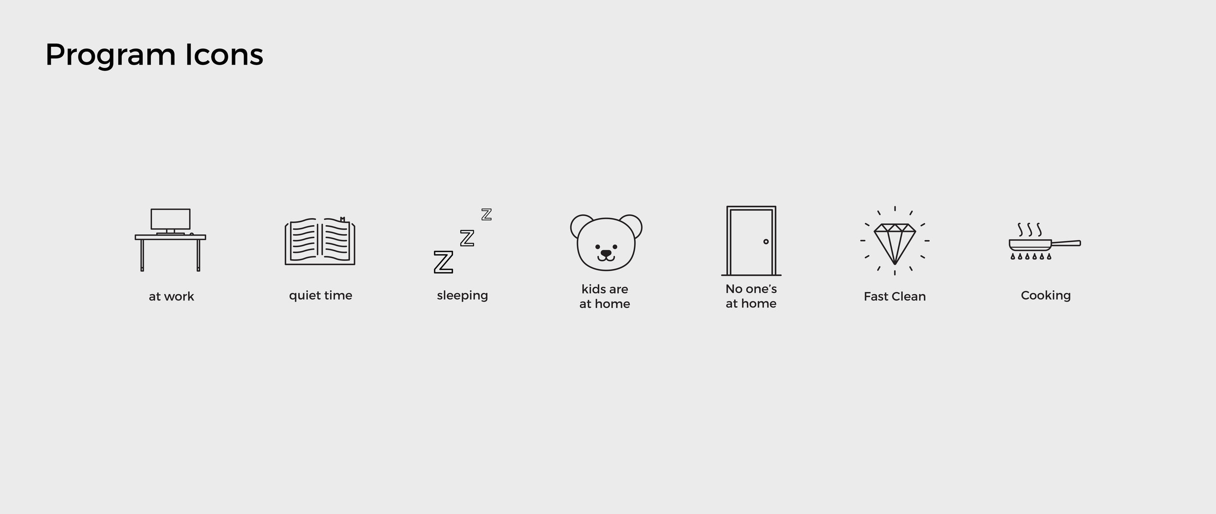
Icons used in the app
I illustrated all the icons to make it aeris-original, and at the same time keep all the icon used consistent. We got a company puppy in the office so that I illustrated that as well as part of the aeris icon set to show that at aeris, we care about details.

Takeaways and Next Steps
I had not considered accessibility in mind when I was designing for the project, I had to give up many ideas while making the product alive:
Time Constraints: I was proposing different color mode for accessibility purposes but that’s adding up a lot of workload for both myself and the software engineers at the time, so we postponed that for the next iteration.
Color choice: the action color of the app #4ED8D8 with a white background has a contrast ratio of 1.73:1, which fail the WCAG AA and WCAG AAA so that it’s a horrible color for users to experience compared to a white background. That’s definitely the first priority for the next step.Even though spending lots of time doing icon illustrations was like a meditation for me (personally) and it giving me an opportunity to connect what the company cares to the users with a friendly touch; however, it was probably not the priority when developing the project. I should have spent more time working on the basic user flow and the interactions
Putting together a sticker sheet would help both me and the software engineers to make the product happen - I didn’t do that back then. and I definitely should for the next iteration.
Also as well as having light/dark mode for the app should be considered as the next step.