

THE PROBLEM
The previous version of the official website for Vered Bigtree Technology Co., Ltd. was made when the company was still named ‘Vered Bigtree Finance Co., Ltd.’, so that the visual language for the website was still based on the outdated visual branding when the color of blue and yellow indicated the idea of technology and finance. With the updated name of the company, Bigtree Technology wants to bring more focus on its products, with an emphasis on the use of technology to provide digital solutions.
THE GOAL
Design a more engaging web experience for users to understand Vered Bigtree Technology Co., Ltd.
MY ROLE
I worked as a UX designer (focusing both on interaction design and the user interface design) for this website.

Limitations and Constraints
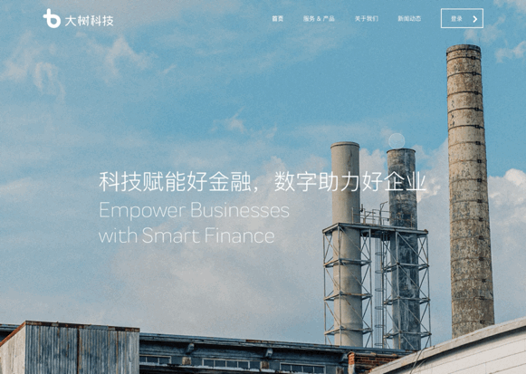
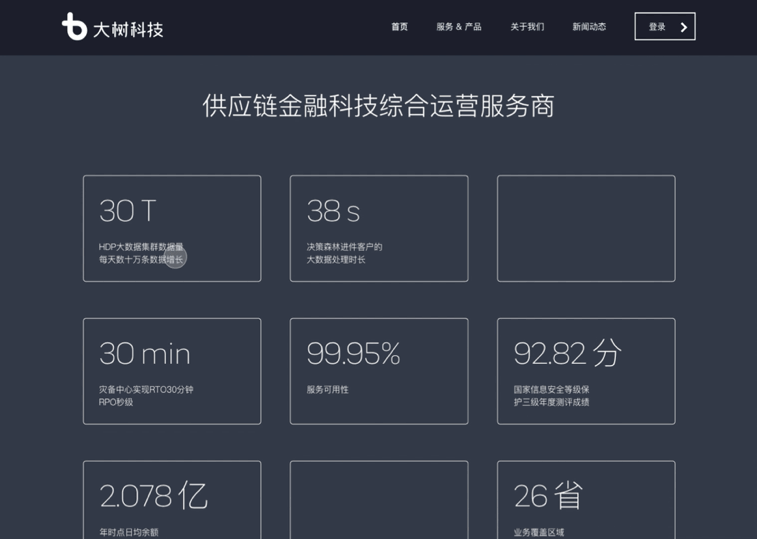
One of the most painful issue I had while working on this project was that I got no real images to show. Everything I used was stock photos because the service Bigtree was providing was a system/ platform, there’s no real-life product except for online services. Bigtree was providing micro and small businesses with digital solutions, and it functions as a bridge between micro-businesses and the bank. It’s hard to visualize both the digital service and the businesses as well as the bank. I tried to use photos of factories, port, and cityscapes in order to symbolize economy and businesses, and turning data into pieces of information to present individually in order to make each info stand out to leave an strong impression for users.

Comparing to the 1.0 version website, the updated project is more engaging for the users. Many users have giving positive feedbacks, and they think the updated website with the new minimalistic aesthetics gives users a direct understanding of the company as well as its services provided.

new version for the career opportunity page

after clicking each job titles, it pops up a new window showing job descriptions.


Comparing to the old version for the career opportunity page, I put the job title as individual card listed on the page, with job description ‘hiding’ underneath the card, and it shows up as a pop-up window when users click through. Such flow gives users a general glance at all the open job opportunities so that they can easily navigate through to see the most related ones instead of going through all the job descriptions.

mobile UI for the website
possible next steps
Bring accessibility into the scope
According to user feedbacks, it is still a bit of vague in terms of the content on the site. I’m thinking of bringing more data visualization into the website so that it creates a direct powerful impact for users to understand the business.
Bringing more product photos (screenshots with desensitization info) into the service description page so that users would have a better understanding on the product being offered.
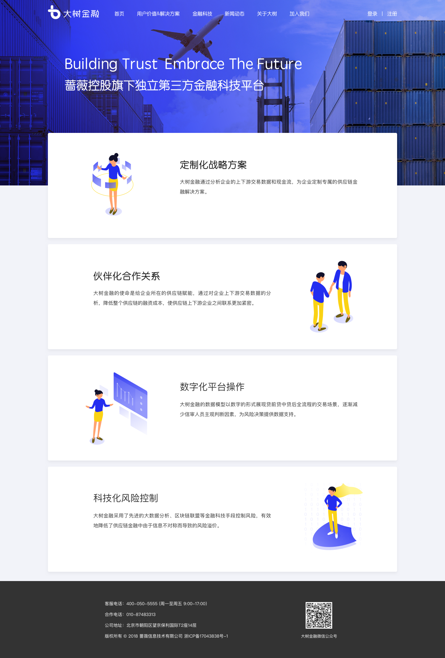
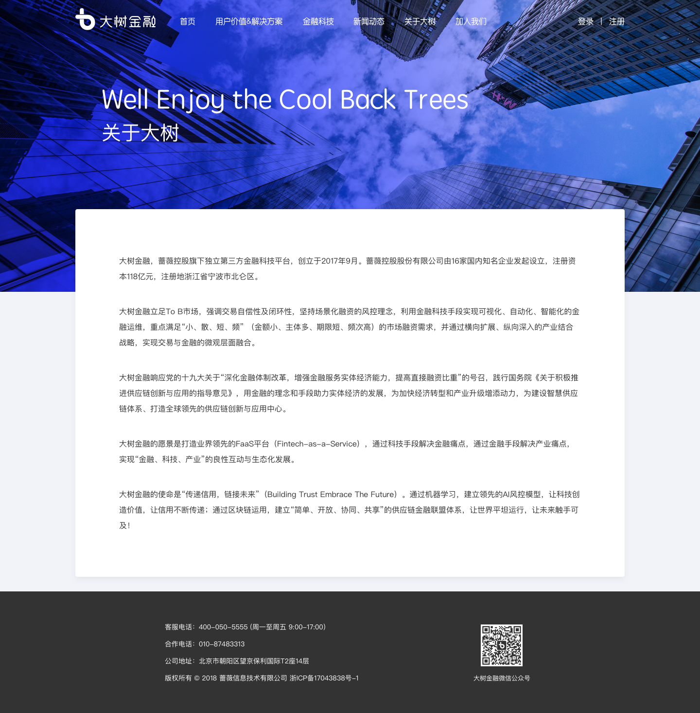
background
Vered Bigtree Technology Co., Ltd. was established in September 2017, with a registered capital of 260 million RMB. Adhering to the vision of "being a technology company that understands enterprises" and practicing the mission of connecting industry and finance with technology to help the real economy, Bigtree Technology is committed to using big data, deep learning and other cutting-edge technology tools to empower the real economy with digital technology solutions.
IDEA/CONCEPT
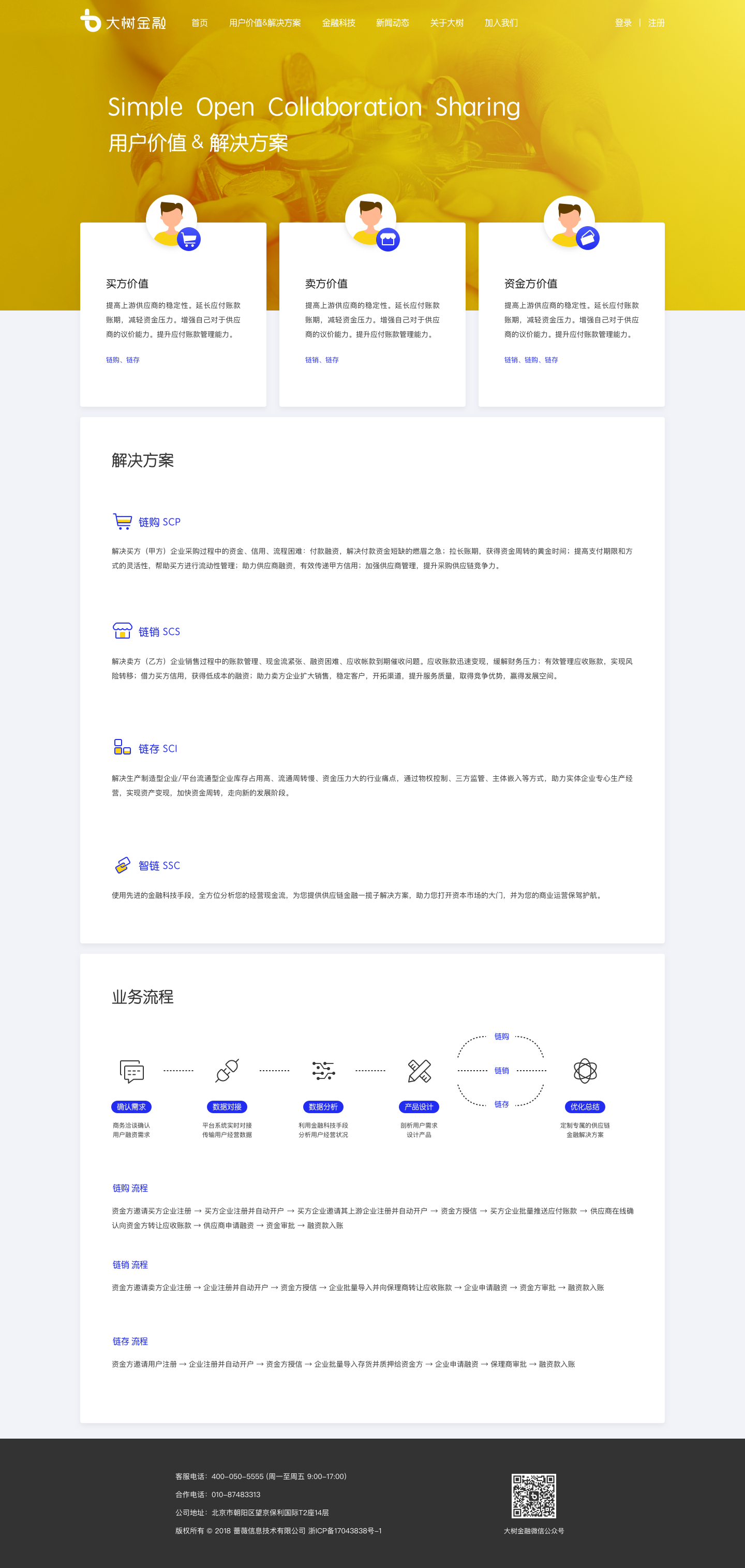
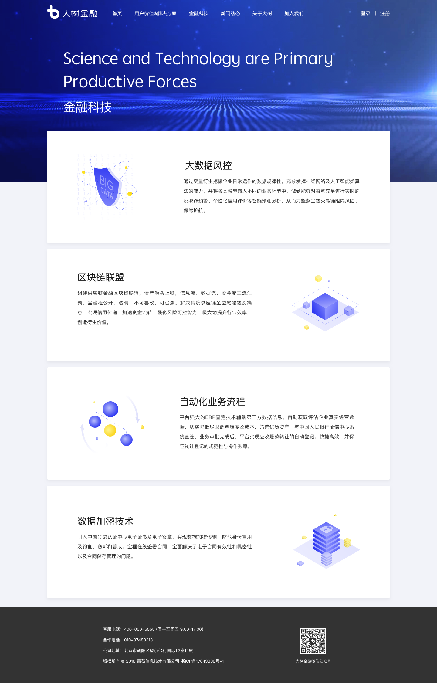
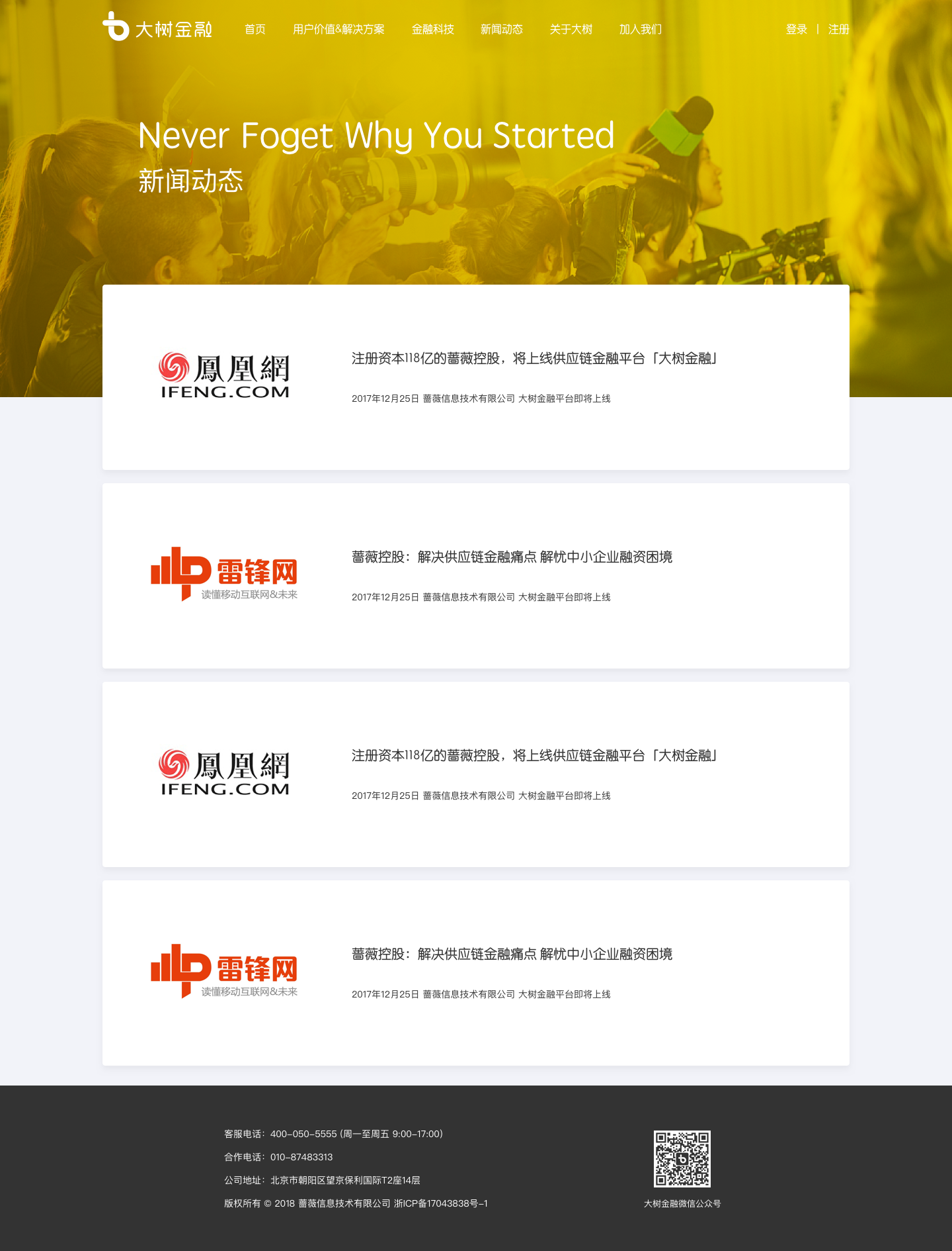
The official website serves as an introduction to the company, it aims to provide a general scope of the company and explain the products to users who are new to our services.
You can visit https://www.bigtreefintech.com/ for the official website
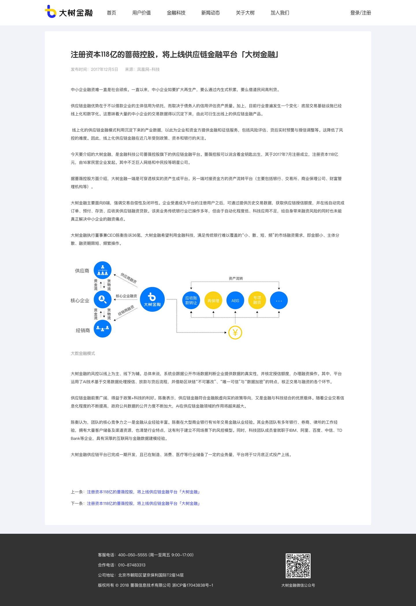
I listed the main site view of the previous website for Bigtree Finance in 2018. (credit to designer Wang Chen who worked on this project back then)
Issues
The website in 2018 focused more on listing out an introduction of the company, the structure was hierarchical, and each page was designed simply to showcase the basic service, and users guide through each page by clicking and browsing. There’s no interaction involved, which is good or bad - it’s easy for users to browse through, but it’s pretty basic and bland.
Solution
Since the website is hierarchical structured, the information architecture is fairly straight-forward. I took the parallax scrolling as a technique for creating this new version of website for making users to have a better engagement.
Parallax scrolling adds not only depth to the visual representation of the website, it brings the user closer to the content. I brought more white space and related photography into the website to stay coherent to the new visual identity of the company, and tiny animations based on interactions have been added to make the website more engaging.


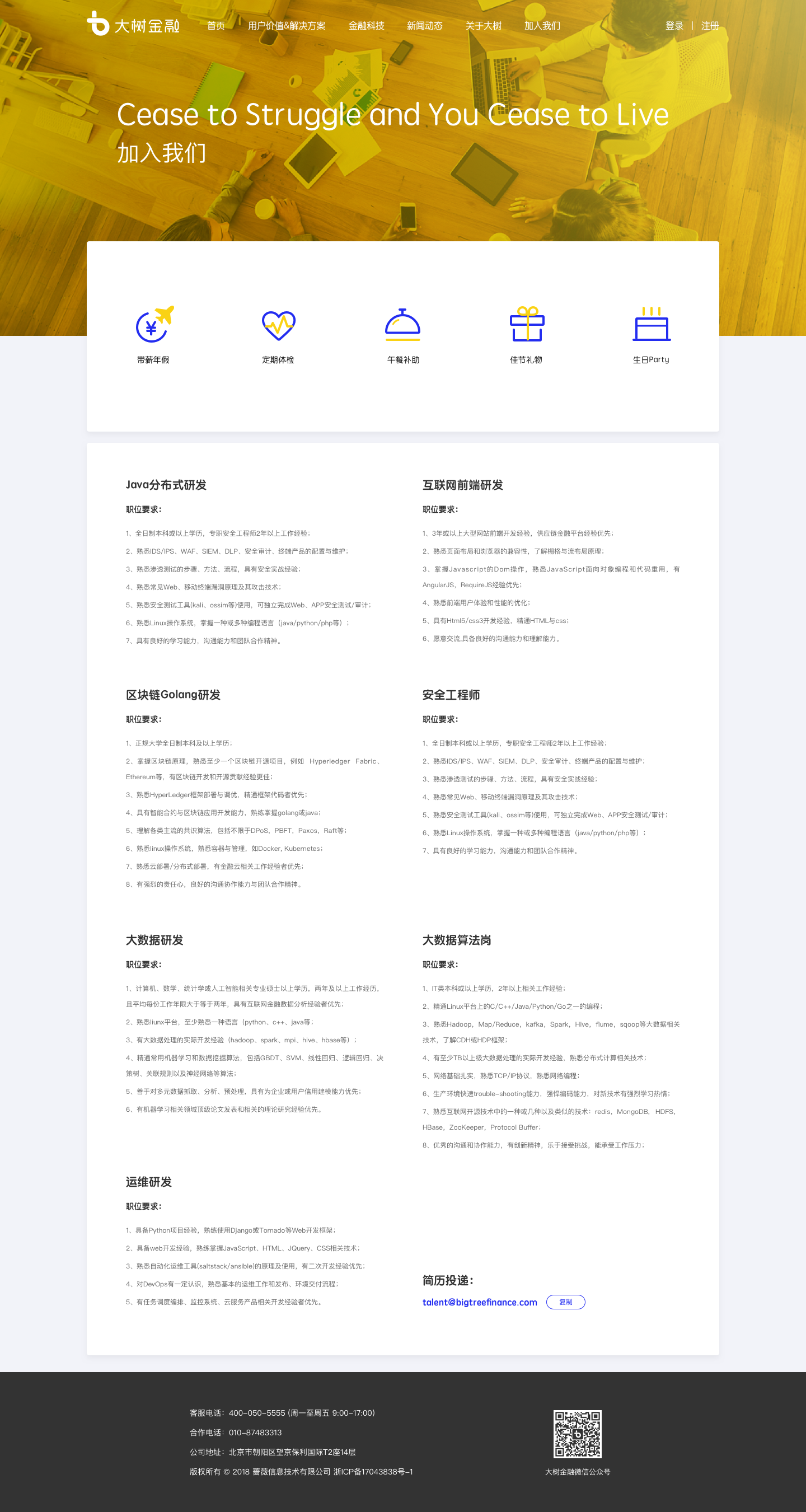
old version for the career opportunity page