

ANGAGE is an online platform for making art class reservations for amateurs who are interested in having an art experience in their free time.
This is a hypothetical project I did for Google UX Design Certificate. I really enjoyed this project so that I‘d like to share some thoughts and working process for this project here.
challenge
Individuals who are interested in art have a difficult time finding art class to enroll during free time.
SOLUTION and goal
Creating an efficient platform that only offers art-related class experiences for users who are interested in such topics.
Target audience
People who are interested in art and want to take intro classes in their free time.
Design a user flow for booking an art class at ANGAGE

process for reserving a class spot at ANGAGE

Research study details
When it comes to reservation services and art experiences, there are lots of competitors on the market. I conducted competitive audit in order to understand what’s out there, as well as to learn from these projects.
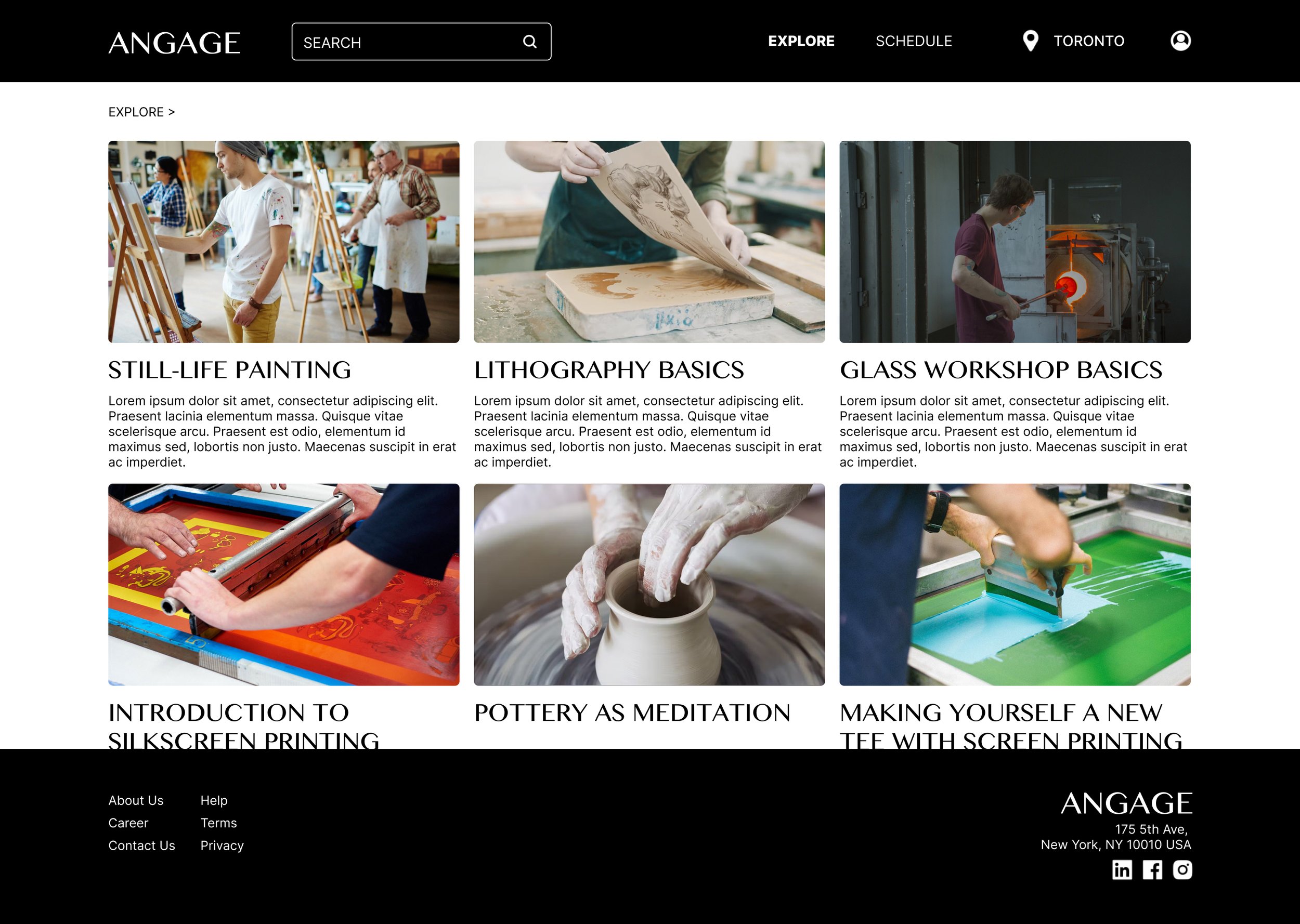
Being specific is one of the most important key point for ANGAGE because art is already a big topic, and I think users who would come for ANGAGE are the ones who just want to have an art experience.


key challenges and user testing
Main challenge is to keep it simple and at the same time make all the information valuable for users. I conducted several unmoderated usability study based on the wireframes and the lo-fi prototypes, there are several feedbacks I got:
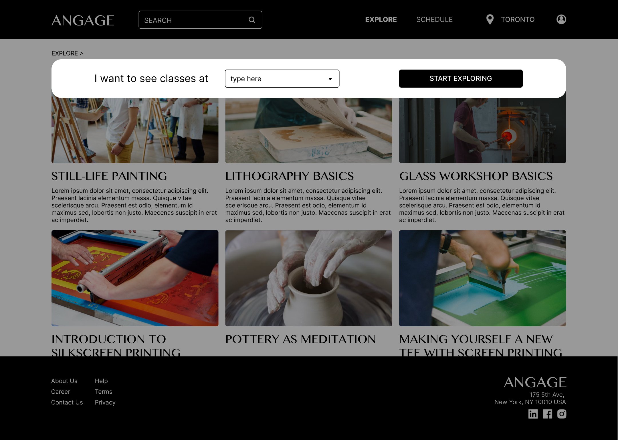
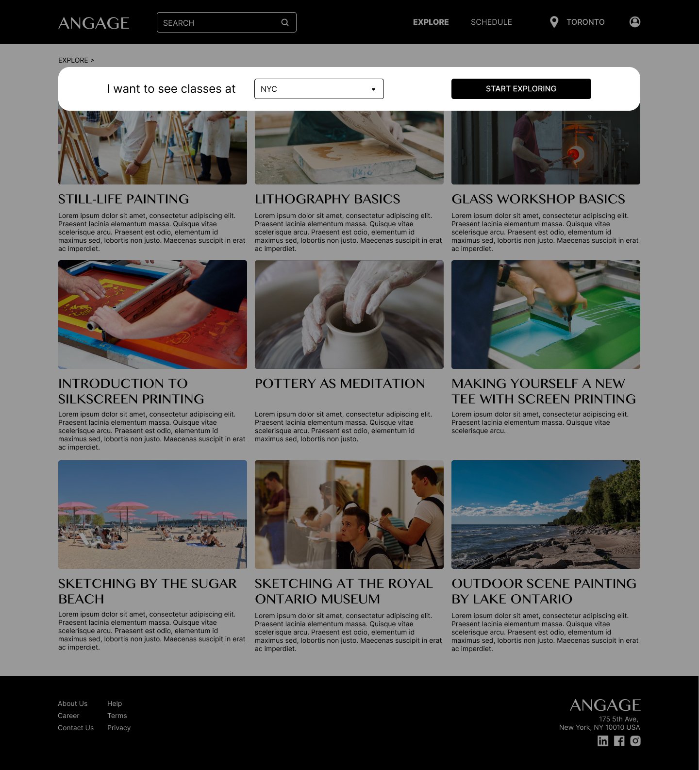
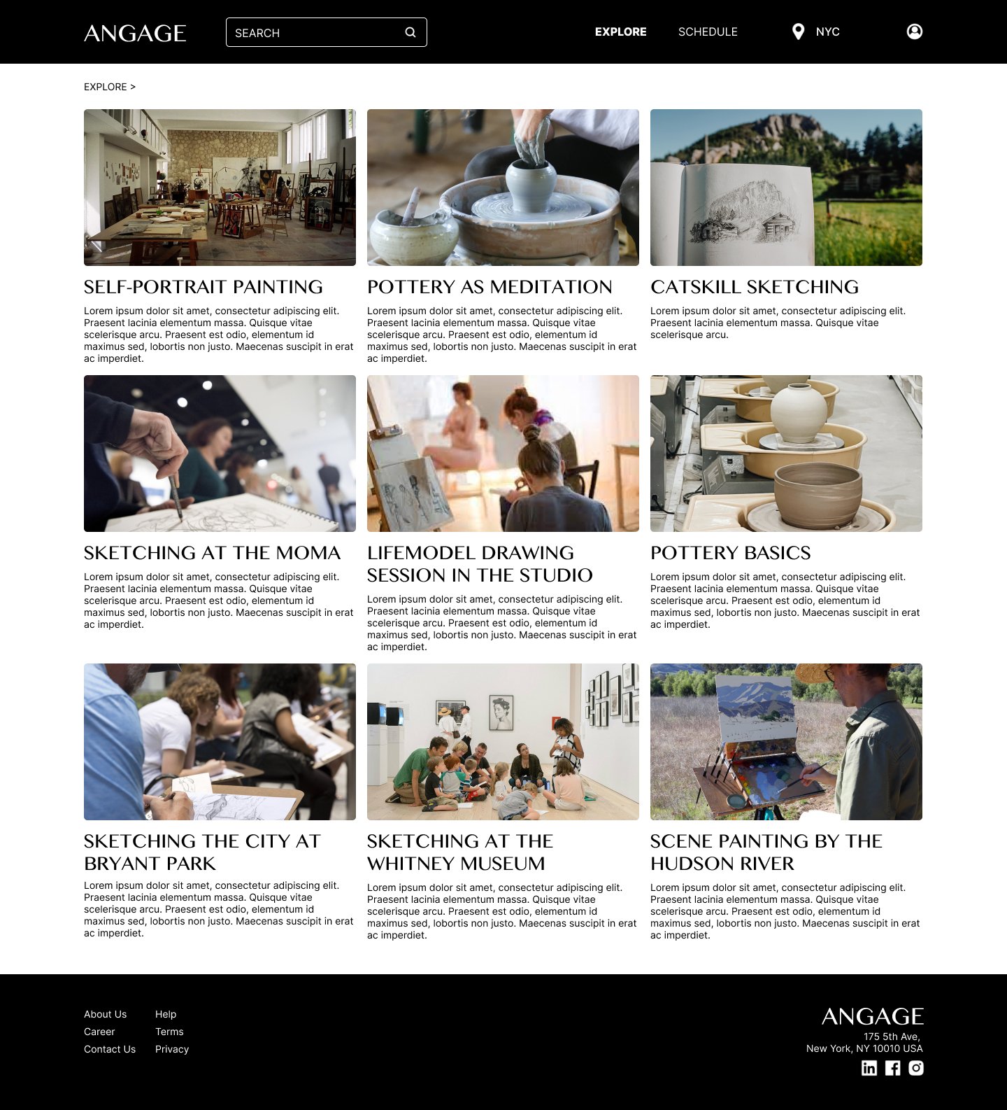
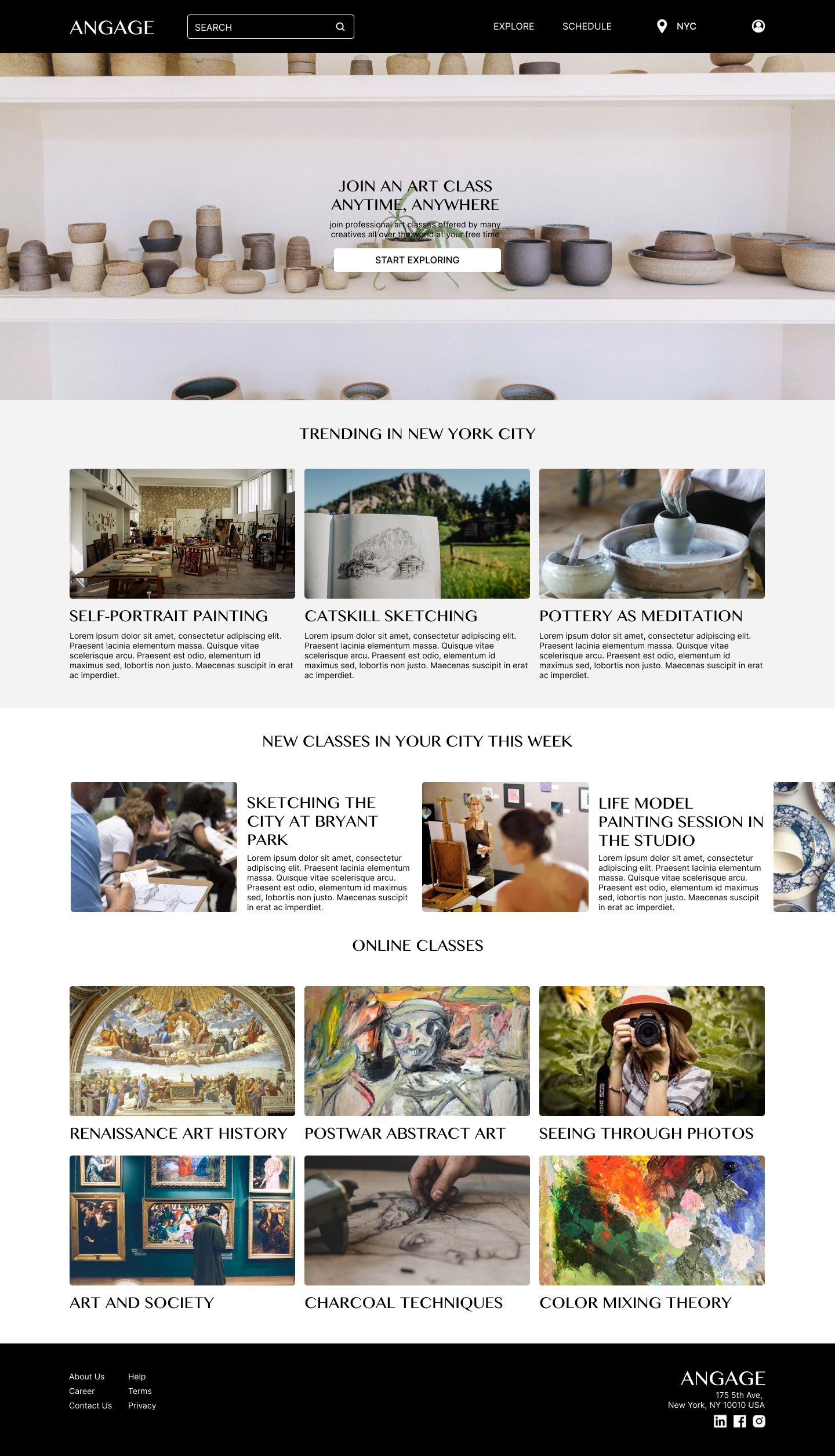
For most users, they only want to see the class offerings at their location. So that users would need an easy switch for changing the location.
Most users find it time consuming to go through too much text on the page, so that users would need a more categorized structure for the website.
Users do not have an understanding level of each class offered, so that users would want to have a review and rating section for each class.


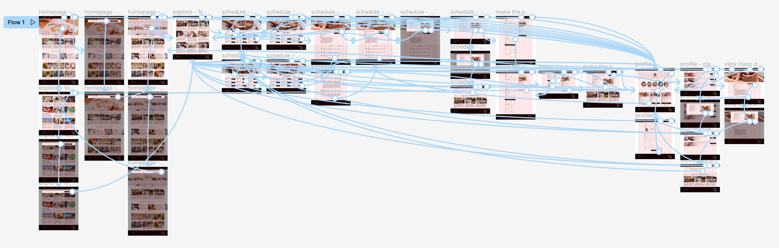
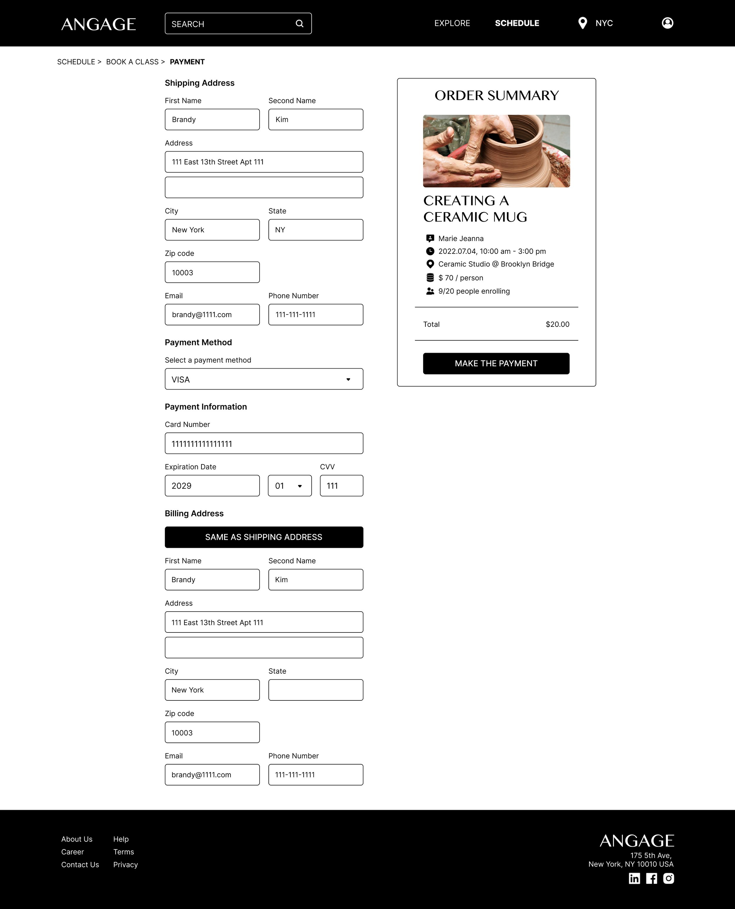
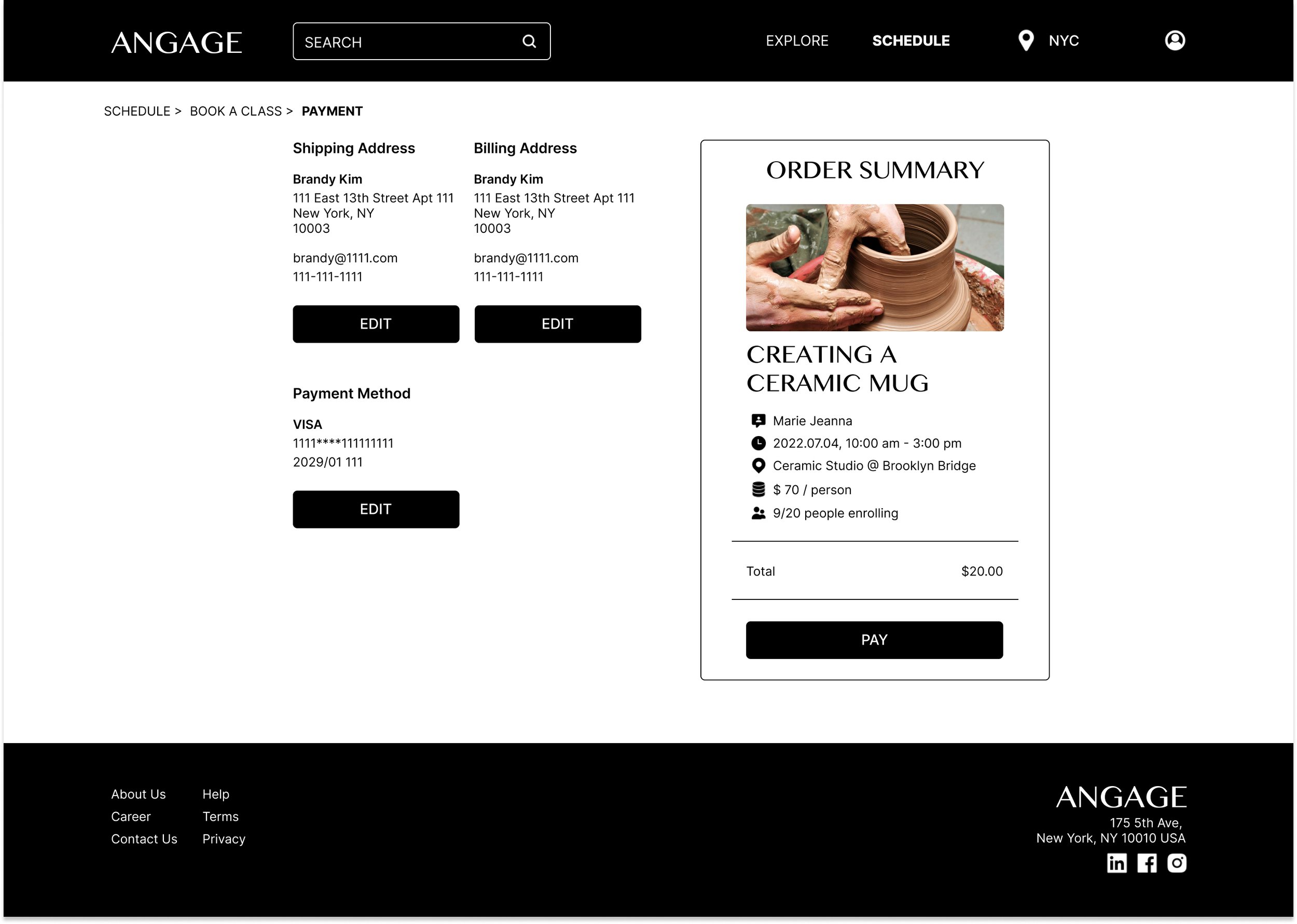
interactive prototypes for the checking out process of booking/ purchasing a spot for an art class, please check the prototype here

Takeaways
For the checking-out process:
Make the process as easy as possible: bringing in auto-filling and location recognition feature so that it saves more of the users’ time
Fulfilling the entire mobile experience (responsive)
In 2021, the number of mobile users worldwide stood at 7.1 billion, with forecasts suggesting this is likely to rise to 7.26 billion by 2022 (based on data on https://www.statista.com/)
When conducting the user research, most of the users have stated that they would more likely to use such services through their mobile phone.Users prefer functions rather than fancy interactions, constant check with the users always give me feedbacks that I’ve never thought of during the working process.
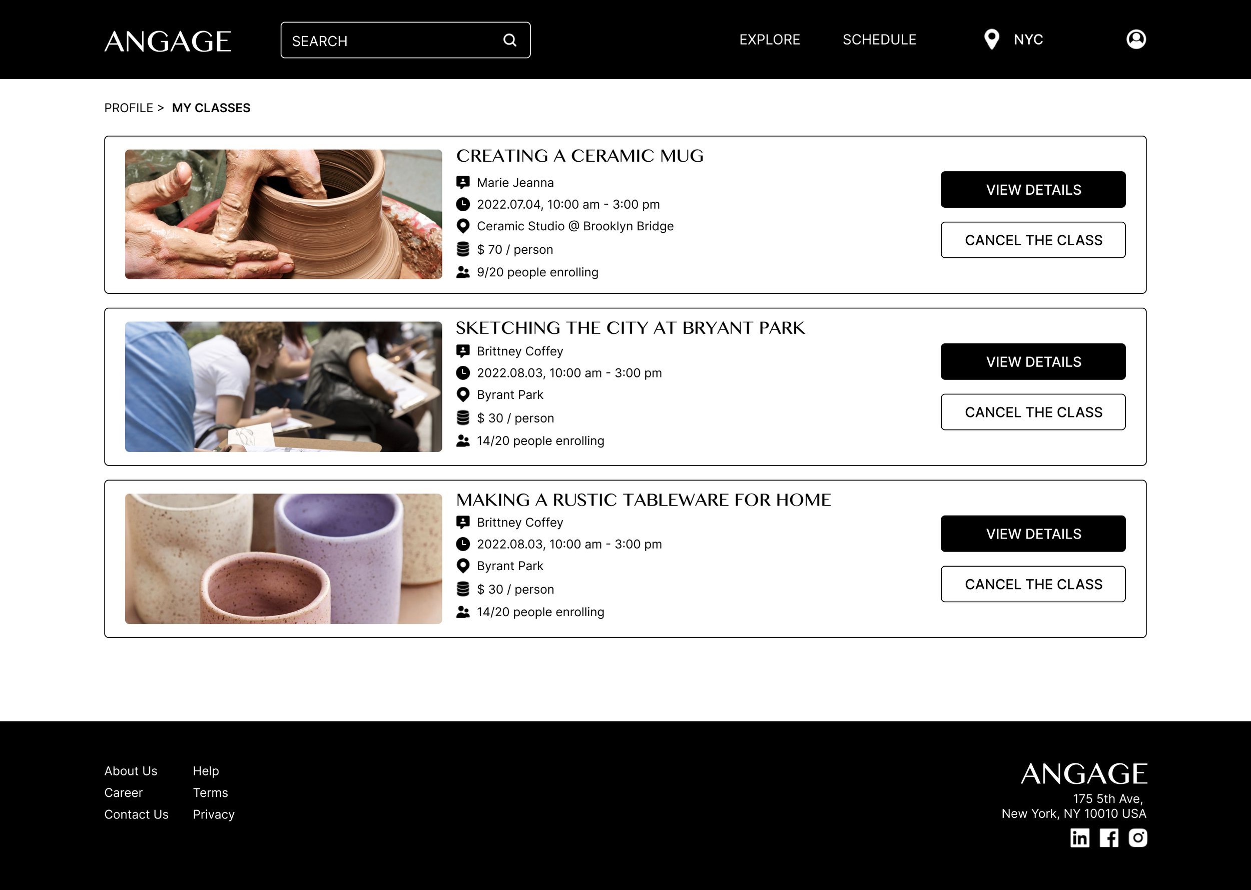
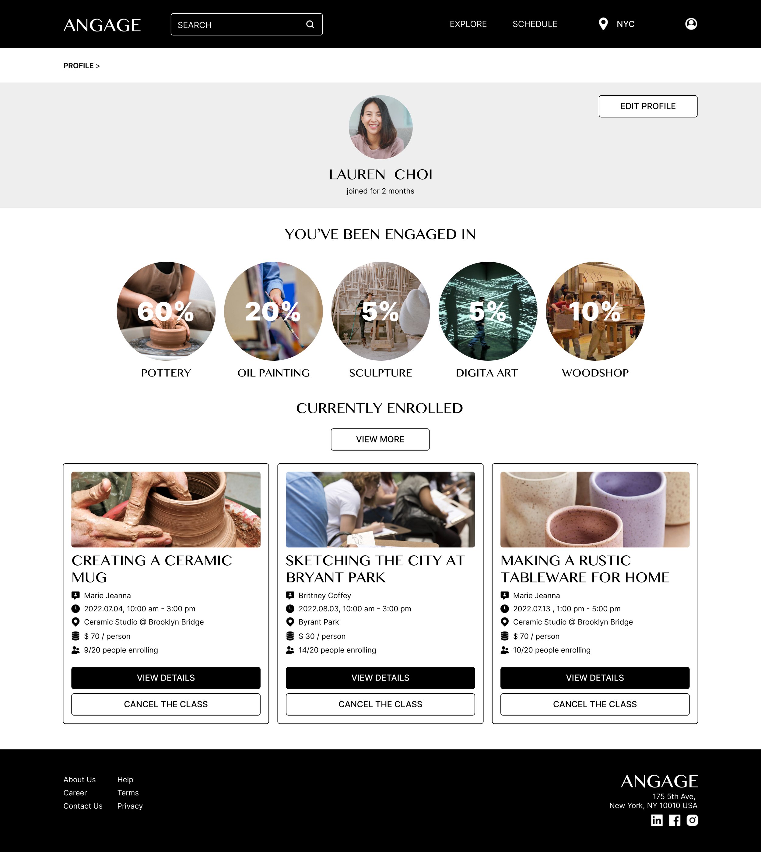
some key hi-fi prototype shots (current stage) and
possible next steps
There are lots of possible next steps for this project:
Accessibility: Make the site more accessible for users with visual or audio impairment
Fulfilling the entire experience: at the current stage, I’ve just done the reservation process, and I’d like to take more time finalize the entire user flow for the site.
Keep up doing user-testing: it’s always nice to hear from people who take the time to go through the process of using the product.
Making the product bilingual: To make China as a location option since there’s no such a platform in China focusing on offering an art experience. At the same time making it more mobile compatible since the mobile coverage is way more crucial than having a desktop website experience.
It would be a nice touch to bring in a reward system: so that users are more encouraged to take more classes.
Thinking of having a social function on the site so that users can share what they’ve learnt through the class with their fellow students and their instructor.