
In this update, I focused on refining the visual hierarchy, improving user interaction flows, and enhancing storytelling through design. The goal was to create a smoother, more intuitive experience while maintaining a clean and modern aesthetic that aligns with Manta’s values. Key changes include updated visual graphics, more dynamic interactions, and optimized layouts for better readability and user engagement.
This UI revision was brought to life through close collaboration with a talented cross-functional team. I worked alongside our design team, including Deep Singh and Jonathan Pereira, to refine the visual language and user experience. We also teamed up with Chloe from the product team to align the UI with strategic goals, while collaborating with Kenny and Somdhar from marketing to ensure the site communicates Manta’s core messaging effectively. Finally, our engineering team played a crucial role in bringing the design to life with seamless implementation, ensuring a smooth and interactive user experience.
Navigation Redesign

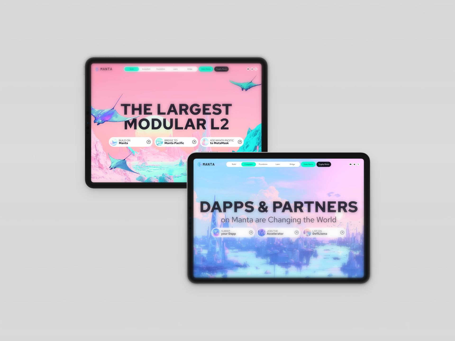
Previously, the navigation bar attempted to fit all content at once, making it difficult to prioritize key information. I restructured it into a simplified menu, moving secondary options (like bridge and token pages) below the main headline. This change declutters the top area and allows the landing graphic to take center stage.


To enhance the usability and visual clarity of the Ecosystem page, I redesigned the filter toggle system with a color-coded tag approach. Each project category—such as DeFi, Social, Infrastructure, and more—is now represented by a distinct color, allowing users to quickly scan and identify relevant segments at a glance. This intuitive visual system not only improves navigation but also brings better structure and hierarchy to the content. Compared to the previous version, which lacked clarity and interactivity, the new design creates a more engaging and user-friendly experience.

old version of the ecosystem page
Logo Refinement
The original logo featured a thin wordmark that lacked visibility, especially alongside other logos in marketing materials. The updated version adopts a more minimal and balanced design, aligning with our new branding direction. By matching the width between the icon and the wordmark, the logo now delivers a clearer, stronger brand impression.
Updated Visual Direction
The old site relied heavily on 3D abstract forms, which felt disconnected from our identity. To align better with our positioning as an Ethereum Layer 2, I introduced a new visual style using minimal, hand-drawn illustrations—created with MidJourney—blending Ethereum-inspired themes with Manta’s unique brand character.
Headline & Layout Optimization
We minimized headline copy for clarity and focus, embracing a clean and informative tone. The landing section was redesigned to go full-page for a more immersive and engaging first impression.

new version of ecosystem toggle system